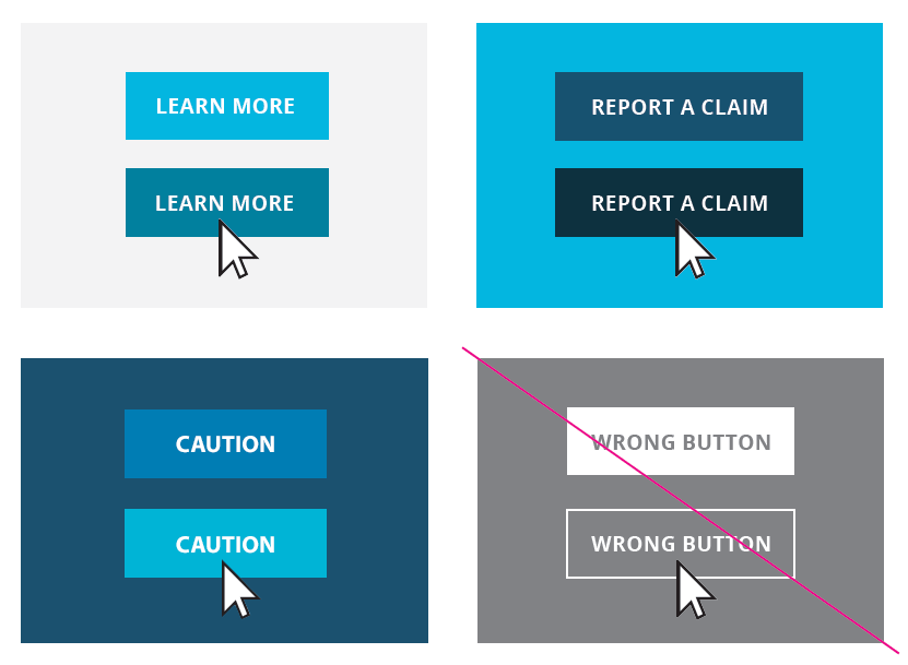
Primary Button
Primary Outline Button
Success Button
Success Outline Button
Secondary Button (Button on darker backgrounds)
Fields
The standard textfield is used for most forms within the application. There's an inset shadow, with a border color and box shadow transition effect on focus.
Alerts
User-generated messages appear as a result of a user taking an action on the page. These message components are displayed at the page and module level. Error validation messaging remains in view until the error is fixed.
Success
Warning
Error
Icons
Several icons are used throughout GuideOne’s brand. Commonly used icons and the approved usage are displayed below.
All icon descriptors are set to ALL CAPS, Open Sans, Bold in P 425 (84.87.89)
![]()
Tables
Tables should be used to present tabular data only, and should be limited to the minimum number of columns needed when possible. On mobile, tables will horizontally scroll to reveal all the content when the table width is more than the browser width.
| Column One | Column Two |
|---|---|
| Column One Value | Column Two Value |
| Column One Value | Column Two Value |
| Column One Value | Column Two Value |
| Column One Value | Column Two Value |
| Column One Value | Column Two Value |

